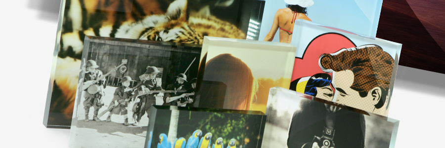
This Years Colour Palette – Perfect for Acrylic Photo Frames
I was intrigued by these interior design ideas for using pale nostalgic colours in our homes this year. Is is also suggested that we add a contrasting bold colour to stop the look from appearing “faded”, interesting, I’m not sure if I agree but it’s definitely worth reading on http://designbuildsource.com.au/2013-interior-design-colour-palette:
American paint companies are suggesting that soothing, pale pastel hues will be a popular trend with interior designers this spring, a stark contrast to previous years, which have seen darker, rich saturated colours prevail on furniture, walls and accessories.
“Now we yearn for colours, designs and simplicity of the past,” says Benjamin Moore Paints senior interior designer Sonu Mathew.
Mathew and other colour experts at the American paint company predict colour trends each year to guide interior designers, homeowners or anyone with a design project in mind.
Benjamin Moore selected ‘lemon sorbet’ as their pick for spring while Sherwin-Williams chose ‘aloe’, both pale colours that promote a sense of nostalgia.
Pastels sometimes get lost or look weak within interior design so Mathew suggests “contrast” should be the design word for 2013.
Contrast applies to both texture and colour, and since fabrics and accessories used in interior design are more tactile, Mathew says “we’ll find things that shimmer and shine next to things that are dead matte.”
He suggests creating extreme pairings by using pastels with edgier, brighter colours.
Yellow commonly represents optimism, which Mathew says goes with the economic times. He says as the world gradually turns the corner out of recessionary times, yellow represents a positive outlook. Mathew suggests the colour is best used in the kitchen.
Sherwin-Williams chose aloe, a minty green, after sneaking peeks at European fashion and design shows.
“While aloe’s vibe can verge on retro, when paired with caviar blacks, crisp whites or soft grays, suddenly aloe has a new soul and attitude,” said Sherwin-Williams director of colour marketing Jackie Jordan.
Jordan says the bedroom and bathroom are the best rooms to integrate aloe into the design.
Decorating ideas are increasingly integrating the reuse and reinvention of older items rather than starting with a blank slate. Using old or vintage accessories with a bold colour in a pastel room can add to the vibe of a past era.
By Kristen Avis
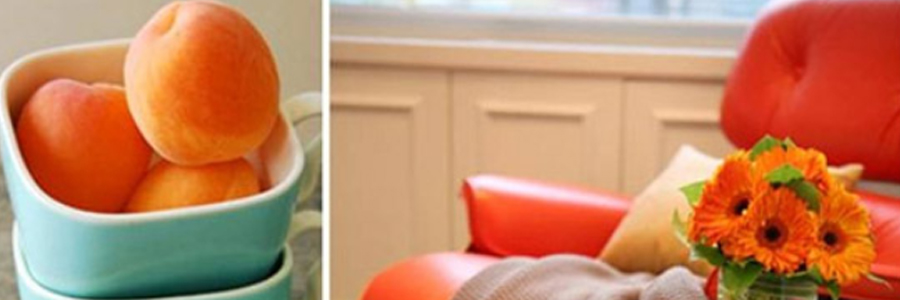
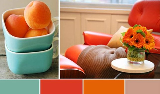
One of the most exciting aspects for us, is that the Acrylic Photo Frames look fantastic against this colour palette. Here is an example of that to give you some ideas:

It is always fun to redecorate, and choosing the frames for your room to complete the look is my favourite part, I hope you enjoy it too. Here is the link to our store where you can find more of our acrylic photo frames: https://getacrylicphotoframes.co.uk/shop
Author: Steve Hogg
For more information on Custom Orders & for General Enquiries please call Freephone 0800 612 3544 or visit the store: